While I was working on my Google cloud solutions architect, I came across a service called Google Data Studio provided by Google.
This blog contains some basic information around this service and how it works. It also creates an remarkable dashboard within a couple of hours
Before we delve deeper into Google Data Studio (GDS), it is a good idea to know what it is. Google Data Studio is a free cloud-based data visualisation tool provided by Google that allows a user to build interactive dashboards and customised reporting.
It is a collection of visualisations tools such as software services, apps and data connectors. It allows the user to create impressive visualisations by providing excellent self-service functionality. An example of this is in the dashboard below:
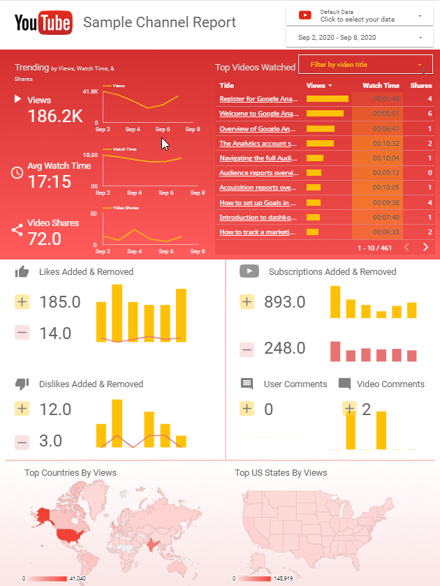
How it works is that it connects all your disparate data sources to build interactive dashboard reports based on Google’s scalable architecture.
Google Data Studio was released to beta in mid-2016 and was generally available in 2018.
Users can access these reports by navigating to Google Data Studio and logging in using their Google credentials. Please note a personal google account works for this purpose.
Logging in brings up some sample reports and options to build your visualisations as shown:

The dataset used for this post comes from Kaggle and is Video Game Sales which was copied into a Google Sheet document.
The following sections will go over building a demo visualisation using Google Data Studio
To get started with creating reports using Google Data Studio start by selecting Create as shown below
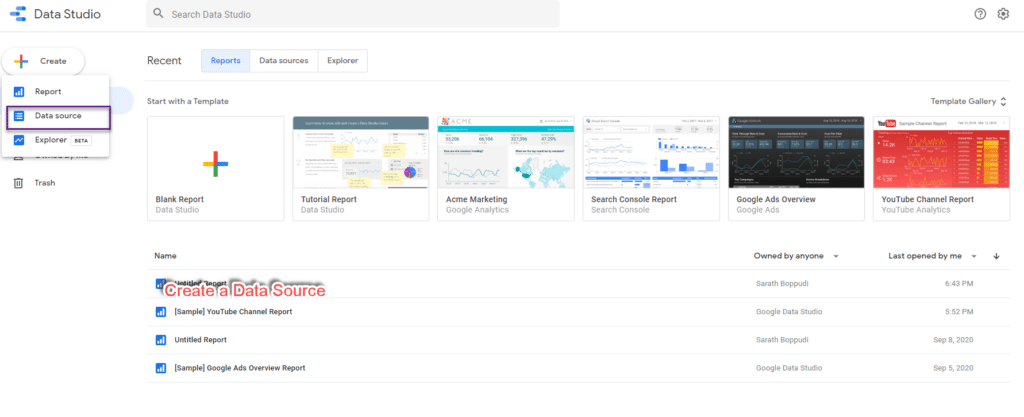
Selecting this option opens up several connectors, a sample of these connectors are below
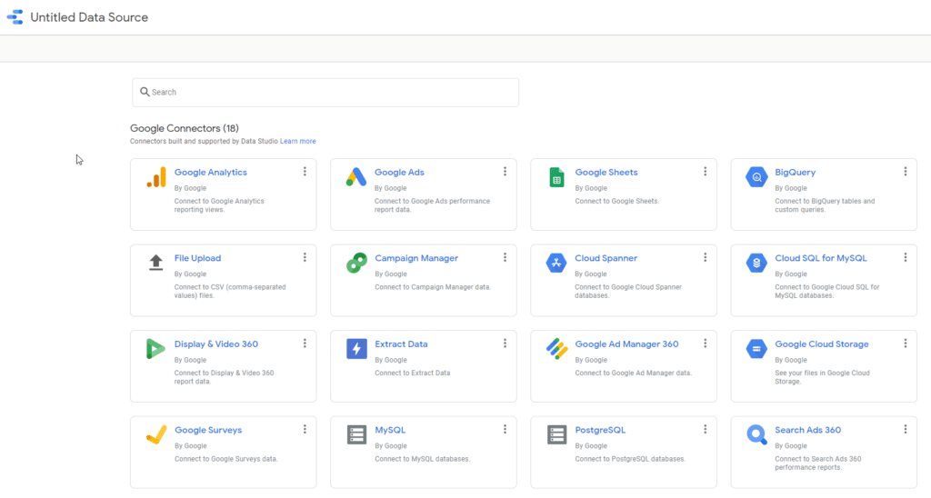
Select Google Sheets option from the list of connectors. This will open the following window
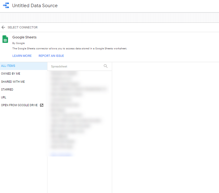
Select Open From Google Drive option. This will open a new window with the list of files in Google Drive as shown below
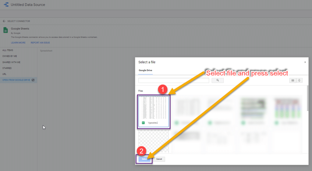
Click the VGSales2 file and Click on Select as shown on the diagram. This brings up the following window.

Click on Connect as shown will bring the open the following page. Click on Create Report

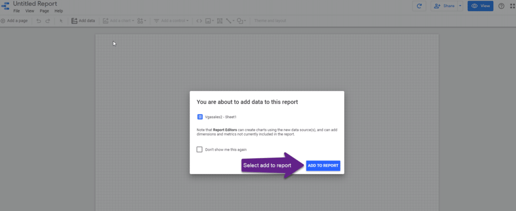
Clicking on Create Report will open a new report, and a dialogue box asks if you would like to add data to the report. Select Add To Report
Clicking Add to Report will open Google Data Studio’s report editor, as shown below. Use the Toolbar to additional charts and drop data elements from the right side of the editor
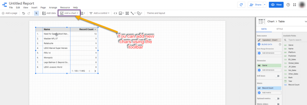
Add some additional charts and filers using the Toolbar as shown in the following screenshots.
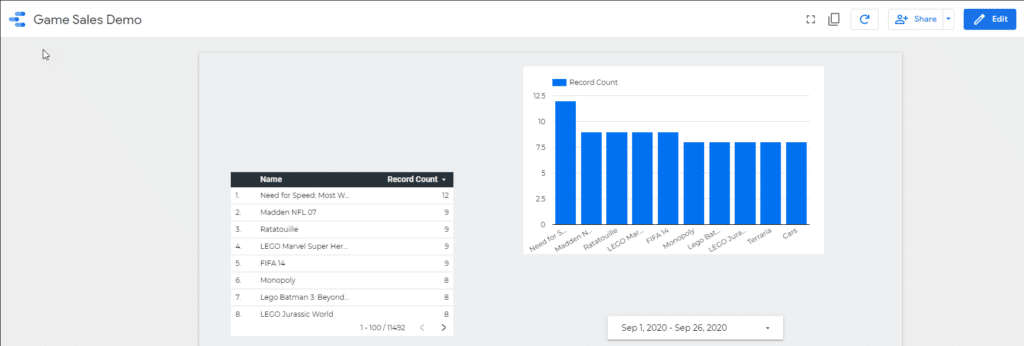
Here is the are additional visualisations to the chart
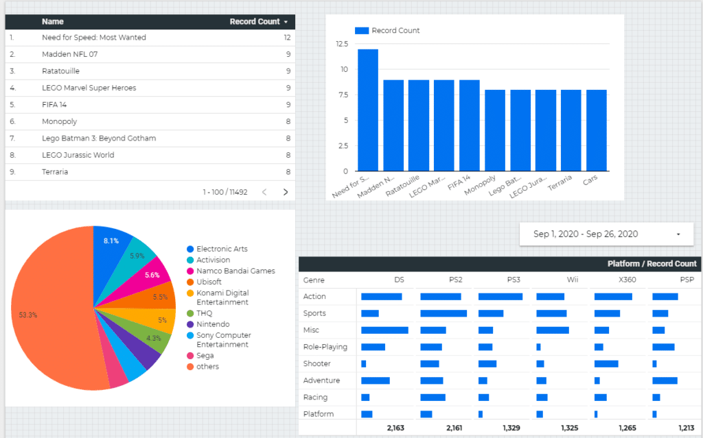
The following is the final output of the report. Google Data Studio offers the use of various themes and I have just selected one from the list to return the following visualisation
As you can see, it is easy to create stunning dashboards using data within Google Studio.
The next steps in the journey are to create reports based on other data sets.
My next aim is to create an article on Power BI. In the meantime, you can see some of my other articles on Home Page
Sign up with your email address to be the first to know about new publications